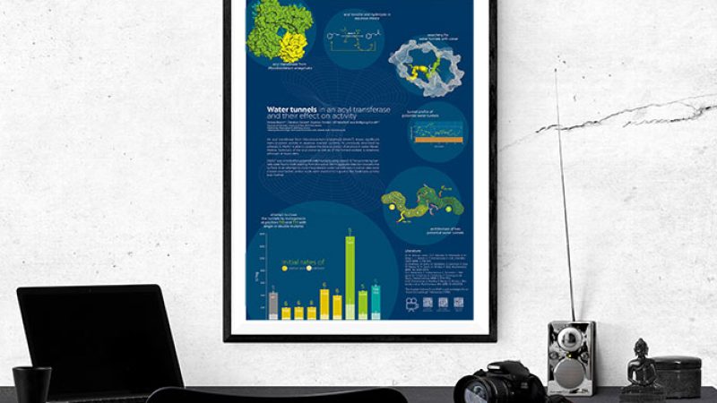
The last conference I attended had 455 poster presentations divided into 3 designated poster sessions (2 hours each). If we do the math, this would leave one with less than a minute for reading each and every poster. Of course, this is not how poster sessions work; however, it nicely illustrates how much competition you face as a poster presenter. Designing your poster well can give you an edge when it comes to getting recognition for your work.
I truly believe that the reason why scientific posters look like they do today, is that the design was being passed on from one generation of scientists to another. This is also how I got the design of my first poster. I asked an experienced colleague of mine for help and he gave me a PowerPoint template that he got from a former colleague, who also got it from a former colleague and so on and so forth. Don’t get me wrong, there is nothing fundamentally wrong with how scientific posters look today; however, they do not hold up to the current standards of graphic and information design. The technology and software we can use to produce our posters has evolved, but unfortunately our designs have not.
Many posters are still designed as if they were a scientific paper. They are sectioned like a publication and contain large amounts of text and an ample amount of data. However, the format of a poster presentation is not suitable for all this wealth of information. A conference poster should be seen as a conversation starter and should help to discuss the science behind it. Therefore, it should be heavy on the side of images, graphs and other illustrations. Remember: You can always “add text” by talking but using words to substitute a picture is nearly impossible.
One tip I always give is to use one “centre piece” that attracts the attention of the viewer. This does not necessarily have to be an artwork, you can work with the images you produce as a scientist as well. Let us have a look at the poster shown here. The main focus (and also the most important information) is the graph representing the results. It is not just randomly placed on the poster but rather positioned in such a way that it serves as an eye catcher as well. Other than that, the poster contains mainly images, which should help with explaining complex matters, and the amount of text is reduced to the bare minimum.
When you design your poster, keep some simple tips in mind!
-
Make the visitor curious about your project. They should want to stop and talk to you!
-
Only show the important results. Even though a lot of work goes into producing data, do not spam your own poster by showing results that do not contribute to your scientific message.
-
Choose adding graphs/images over text! Believe me, when it comes to explaining complex matters, an image is way more effective than a complete paragraph of text.
Last but not least I would like to encourage you to be creative with your overall poster design. There are enough standard-looking posters at conferences, bring a bit of colour to the plain poster rooms.
Picture credits: acib, Poster by Verena Resch
